Dining Room Update

Today I am sharing the update I did to our dining room! When we moved in 4 years ago I felt like all of the wall colors were livable for a while, but the dining room quickly stood out as a room that would be 1) easy because it was a space we could live without for a week or so and 2) a big impact! Especially since it is right off the main entrance. Here are some images of the space from our walkthrough and home inspection 4 years ago-this week! All furniture is the previous homeowners in the next three photos.

That looks like a time-out chair and we now have one that size in the opposite corner. :-)

Funny enough we actually ended up having a mirror hanging in the same spot.

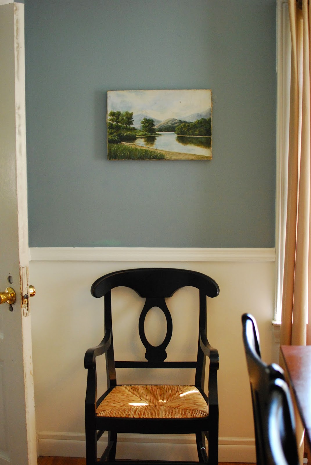
The first thing that bothered me once we moved in was that the chair rail was too low. We have a counter-height dining table so that really made it stand out. The chair rail should be the height of your chairs to protect the wall from where they hit it. I can't remember now how high the chair rail used to be, but I moved it up to 40 inches from the floor to the top of the rail. Also, I felt like the chair rail made the room seem VERY small and didn't accentuate the good height of the ceilings. And why was it the only room with unpainted trim? Don't tell (my fave girl!) Nicole Curtis, but I prefer white trim! And I'm pretty sure this isn't original.
So began some demo! It actually wasn't difficult to move the chair rail. My husband actually did it in 10-15 minutes with a hammer and a level. The difficult part was repairing the wall below where it had been before so you couldn't tell-especially since I was determined to use high gloss paint on the white below the rail.
 |
In this photo you can see the layers of other paint below the chair rail that I discovered as I sanded the area to make it smooth. There was a LOT of patching. You can also see some paint colors I sampled above the rail to the right. I looked at a Benjamin Moore's Kennebunkport Green and Providence Olive. After getting them on the wall I realized the green was the same that had been the previous color and just wasn't right and the olive was basically the same dark color that was there now. Funny, right? |
 |
| Looking out towards the street, you can see the patching was intense! |
 |
I also took the opportunity to make sure the nails were hammered all the way in with a nail finisher, then filled in with caulk to make it smooth. Previously, they hadn't been, which made moving the rail very easy. Also, I caulked so you couldn't see gaps where the wall wasn't flush with the rail (its an older house...not much is flush or level)
Once I realized the paint colors I tested were basically not a big enough change it was back to the drawing board...I did some research along the way about choosing paint colors for your entire home to create flow. Here is a link to Benjamin Moore's insight into creating flow! This is especially important for a smaller home, to help it feel larger. One suggestion I liked was looking at the colors on the same strip at the paint store. They share the same undertones and work well together. I knew I wanted our master bedroom to be Benjamin Moore's Buxton Blue because I just love it! The other colors on that strip in their Historic Collection are Jamestown Blue and Yarmouth Blue. I loved all three. I decided Yarmouth Blue would be best for our kitchen because it is the lightest. Our kitchen's window faces north, so there's not a lot of light, and it is on the smaller size. That left Jamestown Blue for the dining room! It gets a lot of sun and could handle the darker color. This whole approach made it a lot easier for me...I have a hard time making decisions (maybe because I'm a Libra? Who knows.) With a million paint colors in the world I needed to set some boundaries. I have decided to stick with the BM Historic Collection for this house. Its working for me. Perhaps a future blogpost for the rest of the house?

This is the tattered and well-loved color strip that I carry in my purse at all times. You never know when you'll need it!
So here are the "after" photos from 3 years ago.
 
I updated the shades on the from the beige that was there when we bought the house to crisp white. Have you seen my post on my recent update to the chandelier?

Cooper doing some yoga. #doodlephotobomb
  I kept the original hardware on the windows. I'm not sure I would have picked it myself, but I like them and see no need to update! I did, however, update from the velvet curtains that were there. They were quite faded and made the room very dark and heavy. I found these grommet top panels for $5 a panel at Kmart (it was some crazy half off sale.) They let in enough light, but still provide privacy. The grommet top makes opening and closing them easier, which is key because we do so often. There are a lot of places to find drapes on the cheap...there's no need to break the bank! Target, IKEA, and even Walmart. Yes, style can be affordable! 
Can you tell Cooper follows me everywhere? But what a difference from that in-progress photo above!
|
And now for the dining room today!!!


 |
| A favorite painting...happy place! |
 |
| A wedding gift from a wonderful friend! She painted this watercolor! |
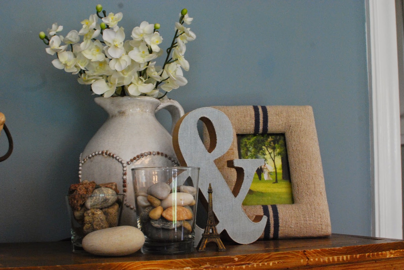 |
| Because every post should have a vignette! |
Project breakdown:
A lot of blood, sweat, and tears
About a gallon of paint
Lots of caulk and putty
Sandpaper
New curtains
Thanks so much if you're still reading!!!
xoxo
jamie

Ahhh! I am so in love with your house! If we ever stop renting and buy Im flying you there you you can help decorate!
ReplyDeleteThank you Bridget! You tell me when! I'll fly fly fly!!!
ReplyDelete